


In data science, turning raw data into useful insights involves many complex steps. Data visualization is a crucial part of this process. It helps us understand complicated data by turning it into pictures or graphs that are easier to grasp. Let's look at data visualization and its importance in modern analytics. First, we start with getting the data, which can come from different sources like databases or even text and videos. Then, we use smart computer programs to find patterns and trends in this data. Data visualization steps in next. It takes these patterns and turns them into charts or interactive displays that people can understand easily.
There are many tools available to help with data visualization. These tools make it easy to create different types of visuals and explore the data. It's important to make sure these visuals are fair and don't have any biases. Data visualization is crucial in many areas of data science, like big data and predicting future trends. It's not just about making pretty pictures; it's about understanding the data better. By using data visualization, we can see what's really going on behind the numbers.
How Pictures Help Us Understand Information Better
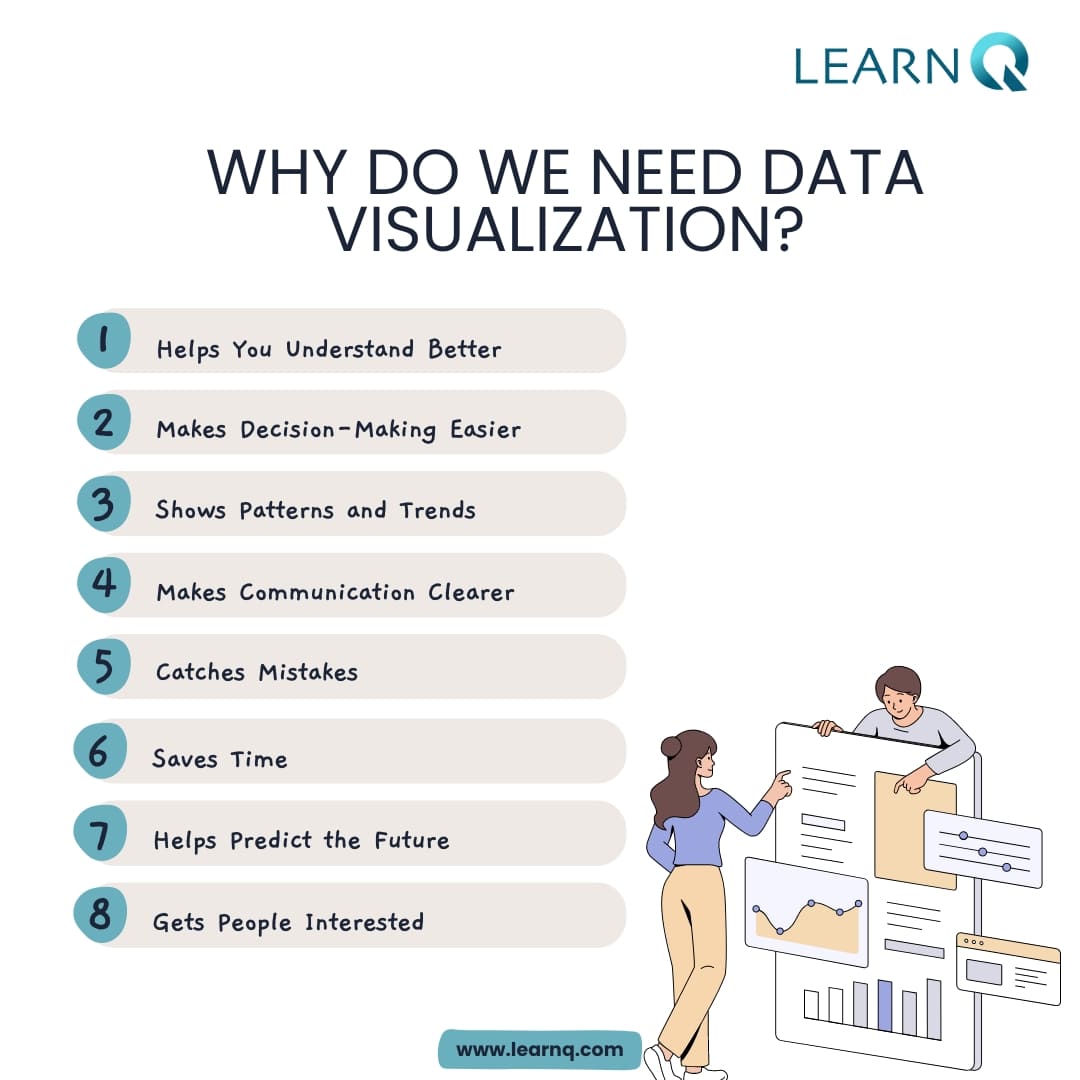
Understanding all this info can be hard, but it's super useful for those who can figure it out. That's where data visualization comes in – it's like a magic key for unlocking the stories hidden in big data. Data visualization is about showing complex information in pictures, like charts, graphs, and maps. It turns boring numbers into easy-to-understand patterns and trends. By using special tools and tricks for visualization, companies can learn more, make smart choices, and share their discoveries better.
Knowing why data visualization matters is really important today. It helps businesses find new chances, spot weird things, and even guess what might happen next. For example, a store could use visualizations to see when they sell the most stuff and manage their stock better. Or a hospital could track how well patients do and make treatments better. But it's not just about making fancy pictures. Good data visualization needs you to really understand the info, think hard about it, and get creative to show the right message. And as we keep making more and more data, being great at data visualization will be key to staying ahead in a world where everyone's trying to win.
Understanding Challenges in Visualizing Information
In the world of handling and understanding lots of information, like collecting data, using machines to learn from it, and the science of data, things can get pretty confusing. While these technologies give us amazing chances, they also make things really complicated, especially when it comes to showing data in a way that makes sense. Let's talk about the tough parts:
1. Too Much Complexity: When datasets get bigger and more varied, it gets way harder to show them in a way that makes sense. With lots of different data sources, structures, and formats, it's easy to feel overwhelmed and tough to find the important stuff.
2. Using Different Data Tools Together: There are tons of tools for analyzing data, processing big data, and predicting things. But making them all work together smoothly for data visualization is tough. Making sure they all work well together and can handle different sizes of data is a big challenge.
3. Changing and Understanding Data: Before you can show data in a useful way, you often need to change it a lot. Cleaning it up, changing it, and putting it together in the right way takes a lot of work and knowing what you're doing.
4. Being Ethical and Responsible: When showing data, it's really important to be fair and do the right thing. With more and more reliance on AI and machines to understand data, we need to make sure we're not being unfair or hiding anything important.
5. Understanding Complicated Data: Visualizations are only useful if you can understand what they're showing. But understanding really complicated visuals needs a mix of knowing about the topic, understanding statistics, and thinking carefully. It can be hard to see important patterns or things that don't make sense in a sea of data.
6. Getting and Understanding Data: Getting data from different places can be hard. Sometimes it's not complete, or it doesn't match up with other data. Putting it all together in a way that makes sense and is reliable is important.
7. Dealing with Really Big Data: As data gets bigger and more complicated, the usual ways of showing it might not work anymore. We need new ways to show really big sets of data that still work quickly and don't get too confusing.
8. Talking to Different People: Showing data to people who might not understand it well can be tough. We need to make sure that everyone, from the people who know a lot about data to the ones who don't, can understand what the data is telling us.
How can Data Visualization help us understand complicated information?
Data Visualization is like using pictures and graphs to make complicated data simpler. It helps us see patterns and trends that might be hard to spot in just numbers. With things like charts and interactive graphs, Data Visualization helps us understand information better. It takes big sets of data and turns them into easy-to-read pictures, so we can figure out what it all means. This is super helpful for businesses and scientists because it helps them make smarter decisions. Basically, Data Visualization makes it easier for us to understand lots of information at once, so we can use it to do cool stuff and make the world better.
Data Visualization: Making Data Easy to Understand and Use
Have loads of data. But just having it isn't enough. We need to make sense of it and use it to make smart choices. That's where data visualization comes in. It's all about turning complicated data into pictures that anyone can understand. Let's see how it helps:
1. Making Things Clear: Instead of staring at a bunch of numbers, data visualization gives us colorful charts and graphs. These visuals help us see trends and connections in the data way more easily.
2. Spotting Trends: Sometimes, important trends hide in the numbers. But with data visualization, we can uncover them. Whether it's noticing changes in sales or spotting unusual customer behavior, the pictures make it easy to see what's going on.
3. Better Decisions: When we can see the data in front of us, it's easier to make good decisions. We're not just guessing anymore. Visuals help us weigh our options and understand what might happen next.
4. Sharing Ideas: Instead of boring reports, data visualization lets us share ideas in a fun way. With cool charts and graphs, we can show others what we've found in the data without putting them to sleep.
5. Keeping Up in Real Time: New tools let us watch the data change right before our eyes. This helps us stay on top of things and make quick decisions when we need to.
6. Seeing Opportunities and Dangers: Data visualization helps us find chances for growth and spots where things might go wrong. By looking at trends and numbers, we can grab opportunities and avoid problems.
7. Working Together: When we can all see the data, it's easier to work together. Teams can look at the same pictures and figure things out together.
8. Using Data Smarter: When we get good at using data visualization, we start making smarter choices. It becomes part of how we do things, making us better at our jobs.
Data Visualization Tools
Data visualization tools are like magic wands in the world of numbers. They help turn boring data into exciting pictures that tell stories. Let's talk about three popular ones: Matplotlib, Seaborn, and D3.js.
-
Matplotlib: It's like an artist's toolkit for Python users. Matplotlib lets you create all sorts of plots, from simple charts to fancy maps. You have total control over how your plot looks, which is great for scientists and analysts.
-
Seaborn: This one is like Matplotlib's helpful sidekick. It makes creating complex graphs super easy. With Seaborn, you can make your plots look stylish without writing a lot of code. It's perfect for people who want to show off correlations and patterns in their data.
-
D3.js: If you want to make interactive charts for websites, D3.js is your go-to. It's like a wizard for web developers, letting them create cool animations and charts that change as you interact with them.
Data visualization is important in modern analytics because it helps us understand complicated information in a simple way. We use graphs, charts, and interactive pictures to do this. It's like telling a story with pictures. This helps businesses make better decisions and come up with new ideas in different areas. As data keeps getting bigger and more complicated, knowing how to show it visually becomes even more important. Visualizing data helps us see patterns and trends, which helps us learn new things and find new opportunities. Basically, data visualization is a really valuable tool for making decisions and sharing knowledge.